

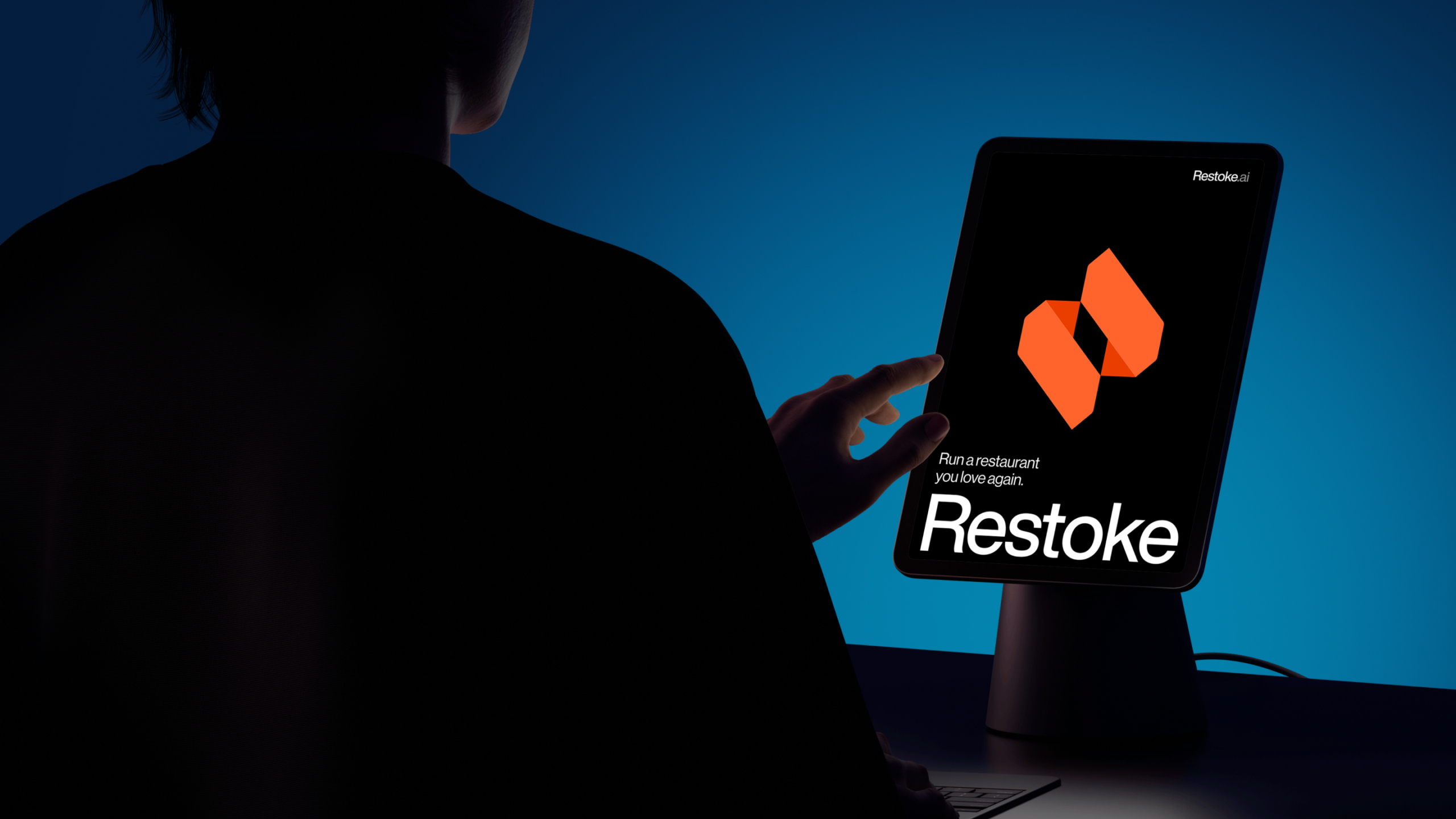
putting the heart back in hospitality
When Restoke came to Oliver Grace, they had momentum most startups only dream of: a $5.1 million funding round, thousands of happy users, and a profitable business built on an AI platform developed entirely in-house. They were preparing to expand globally. What they needed was a clear, sharp story and the confidence to tell it.
AI startups were sprouting like mushrooms, but Restoke had something genuinely different. Their AI platform manages back-of-house restaurant operations, helping owners find efficiencies, unlock savings, and boost margins. They weren’t just entering a category; they were defining it before it even had a name.
Grounded in human insight
Our strategy started where it always does: with the audience. Immersing ourselves in the world of restaurant owners, we sought to understand not just the operational pressures they face, but why they chose this industry in the first place.
There was a clear gap between expectation and reality. People don’t open restaurants with dreams of juggling staffing, filling out spreadsheets, or worrying about the price of avocados. They do it to create joyful, memorable culinary experiences. But the relentless demands of running a business can pull their attention away from the very thing that makes it worthwhile.
From that truth, a brand promise emerged: Restoke’s AI handles the gruntwork, so restaurateurs can get back to the heart and soul of hospitality.

Creative direction with heat. A voice with attitude.
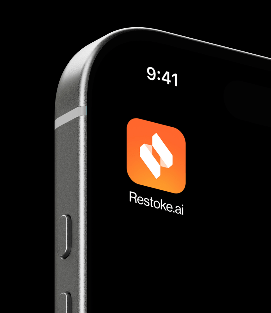
Restoke came to us with a name inspired by the fires of the kitchen, a signature orange, and a flame-like logomark.
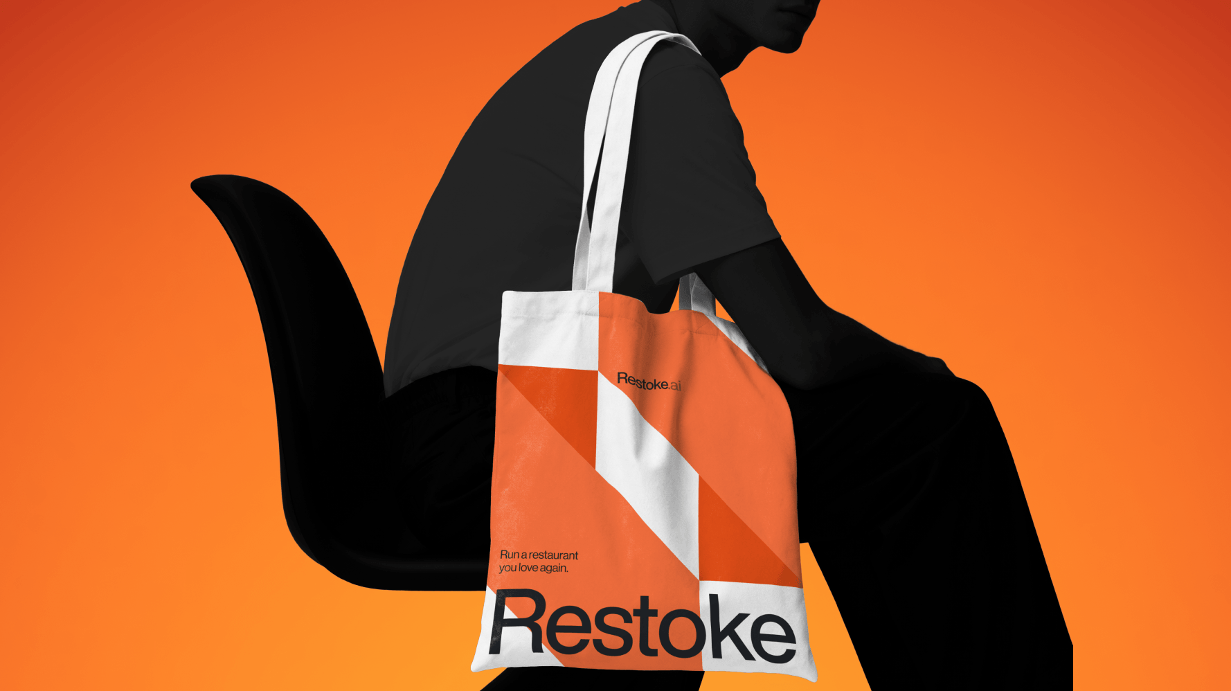
We evolved the mark to be clean and contemporary: a form that’s part flame, part heart, quietly signalling a return to the heart of hospitality.
The palette expanded to embrace the colour and complexity of food — vivid, considered, and alive — while maintaining the legibility of a tech product.
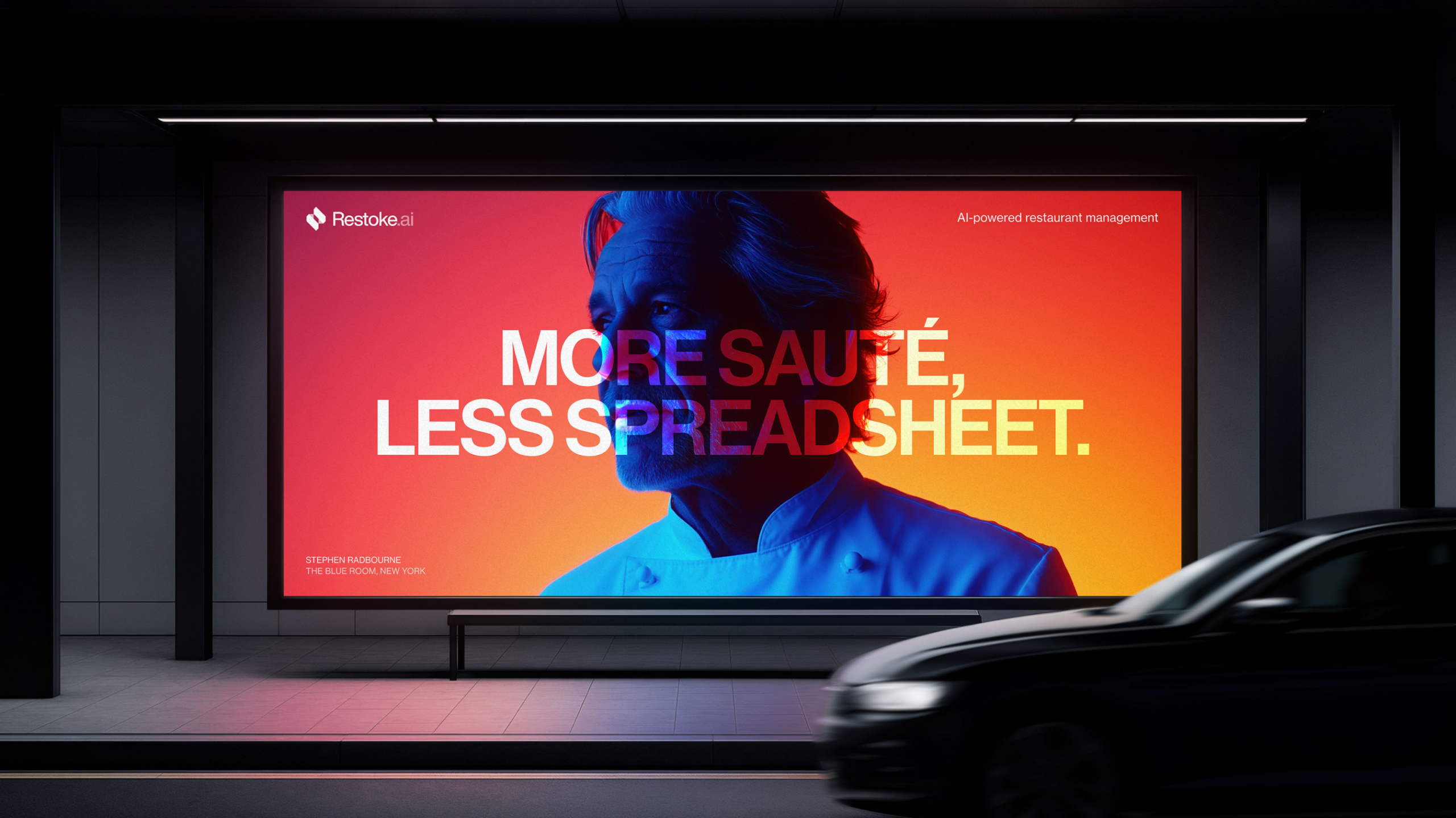
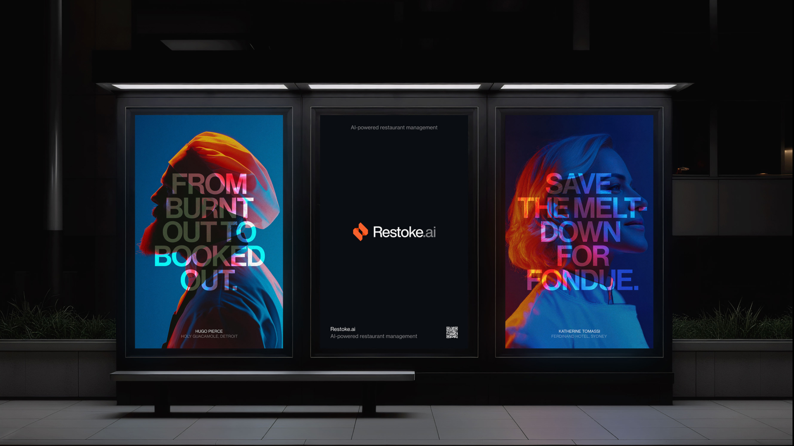
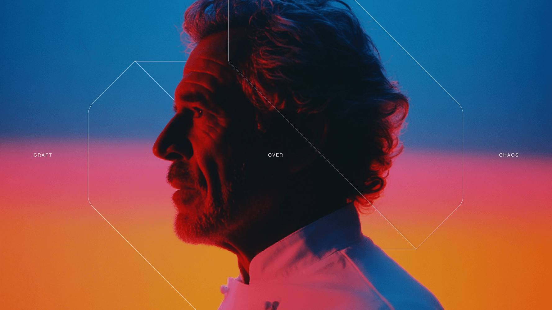
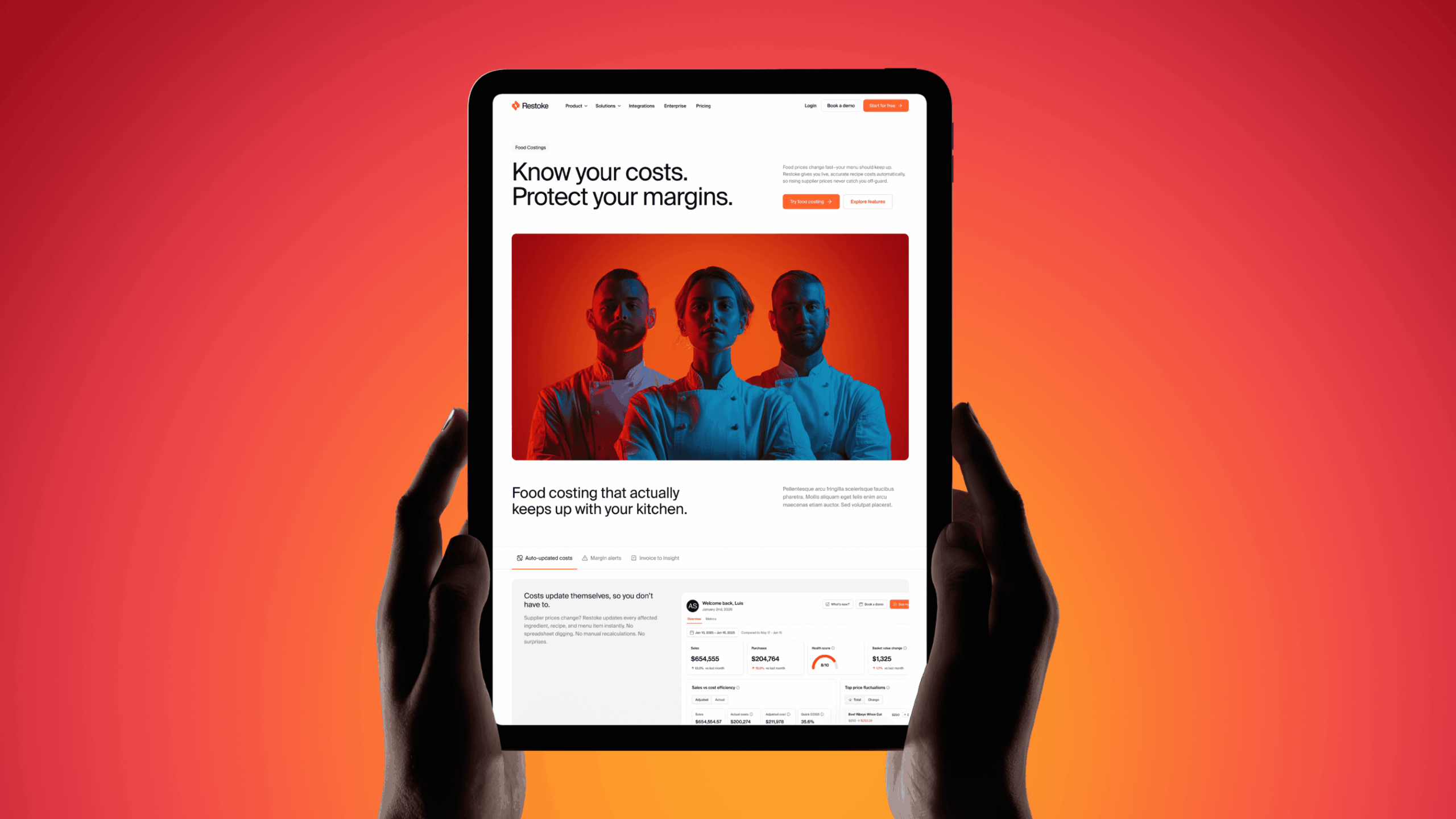
Where most restaurant brands lean on kitchen photography and food imagery, we moved in the opposite direction. The art direction centres on the individual: intimate, cinematic portraits of the people who run restaurants. An oasis of calm against the heat of the kitchen.
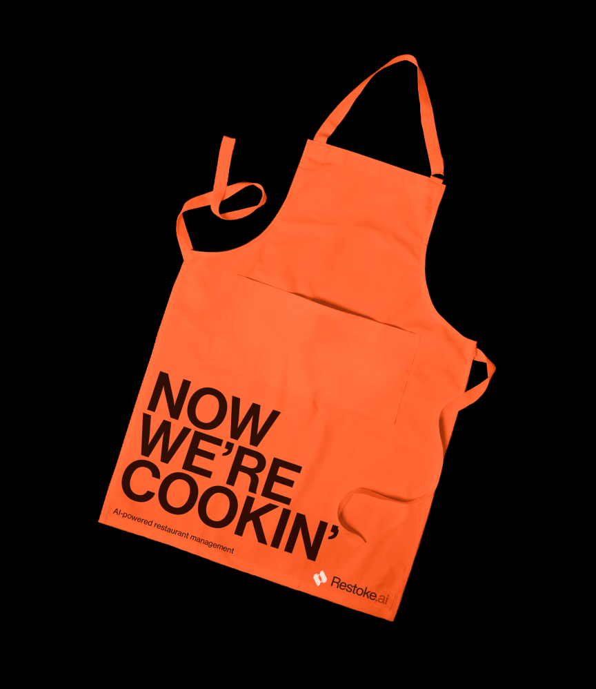
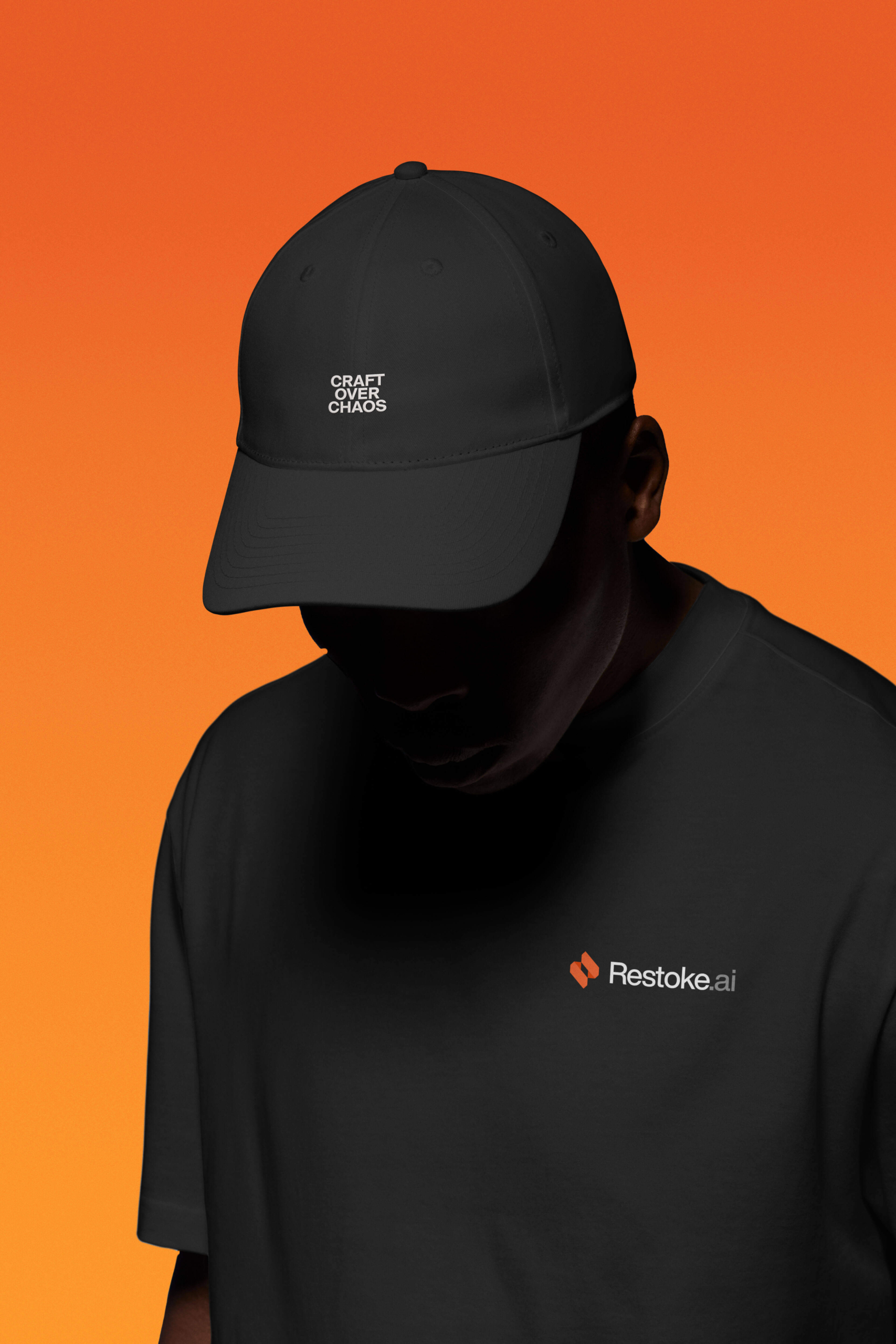
The copy has attitude and a distinct point of view — less a list of benefits, more a rallying cry: get back to running a restaurant you love again. The typographic system is flexible, from sentence case to all-caps boldness, giving the brand a tonal range from mild to spicy, but always in good taste.
Not just brand. Product UX.
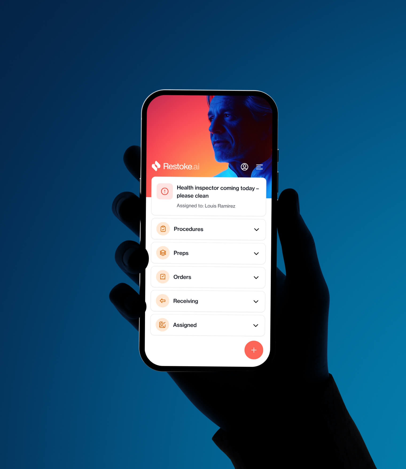
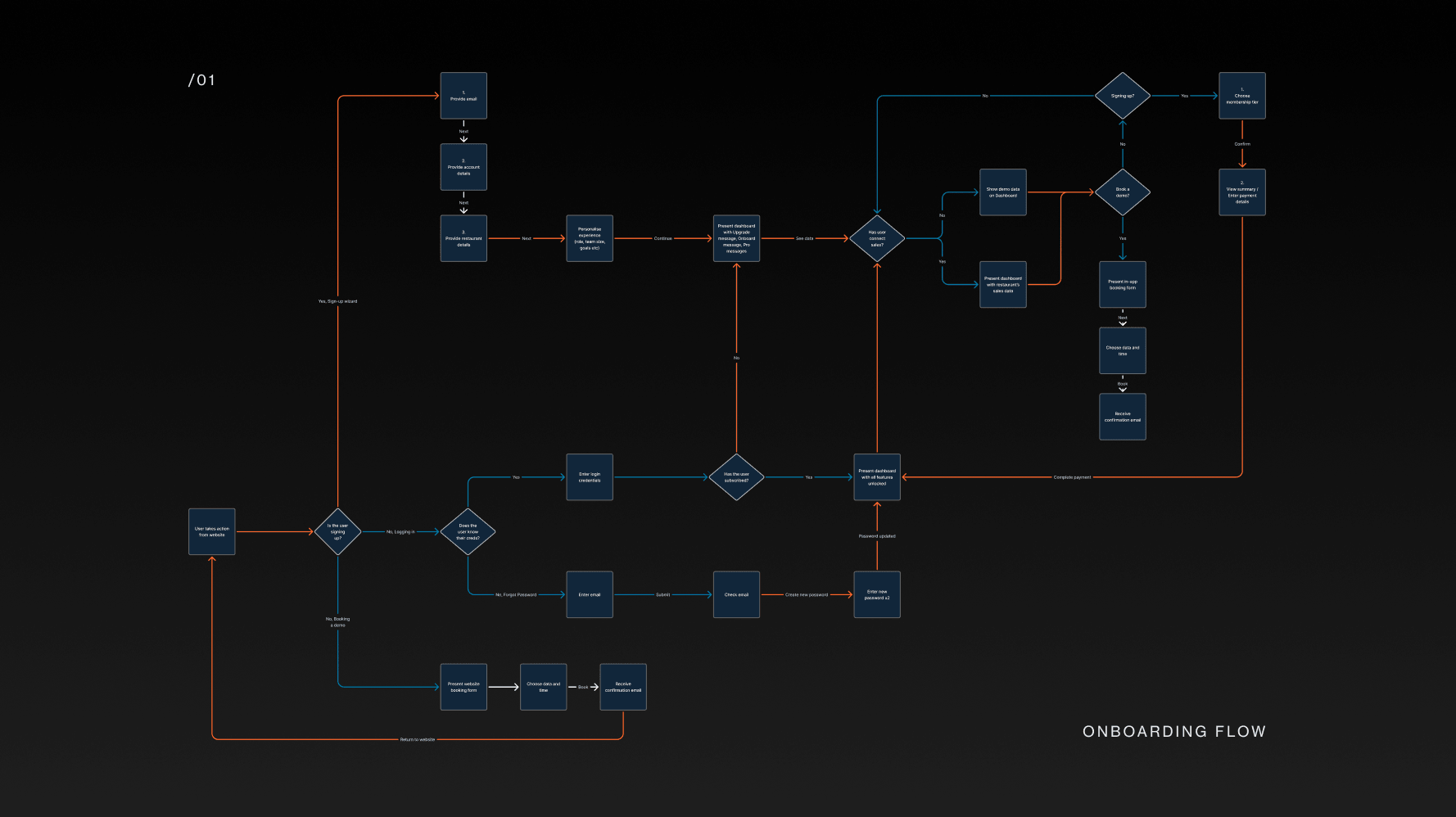
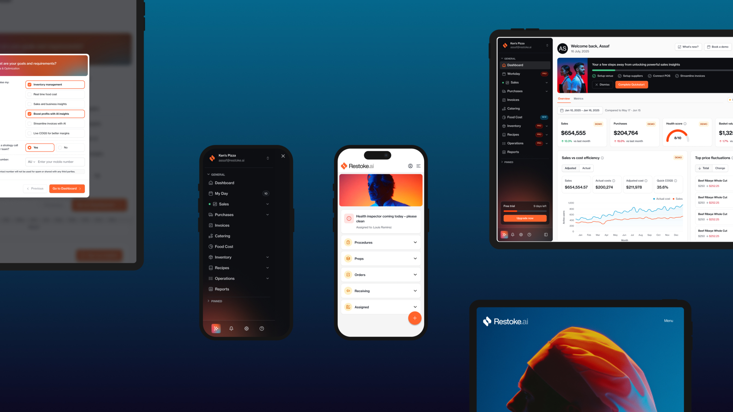
We extended into the product itself, running a parallel UX design project with Restoke’s lead developer to redesign the platform interface and refine the design system across key user journeys. Because there should never be a moment where the product and the brand feel like strangers to each other.

Oliver Grace didn't work for us, they worked with us, deep inside the business, pushing harder every time we pushed them. Together we excavated the real DNA of the brand, and what came back went way beyond a new design. We came out understanding ourselves better, speaking with one clear voice, and dead certain of who Restoke is.
The impact
Restoke now has a brand, a product, and a website that are fully aligned, supported by a toolkit their whole team can use. When a new feature ships, the team already knows the language and the framing to speak to what matters most for restaurant operators.
The category is still emerging. No one owns it yet, but Restoke has everything it needs to be the one who does.

