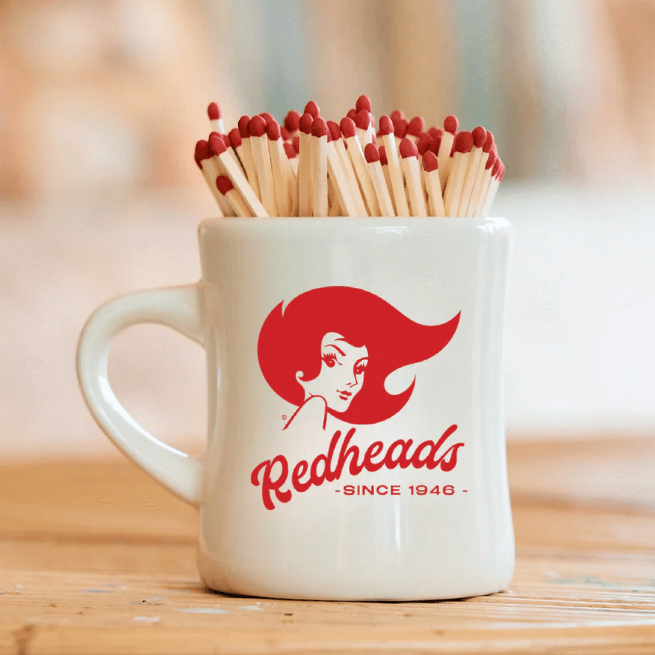
FLAME ON
From hardware stores to grocery aisles, Redheads matches are a fixture across Australia. Since 1946, the brand has warmed hearths and fired up barbecues, enduring across generations. At its heart is the ever-evolving Ms Redheads, a beguiling mascot who’s reflected the style of each decade she’s appeared in.
Redheads engaged Oliver Grace to update their iconic brand for today’s generation. The refresh introduced a new packaging system and a contemporary digital experience, including direct-to-consumer online shopping.
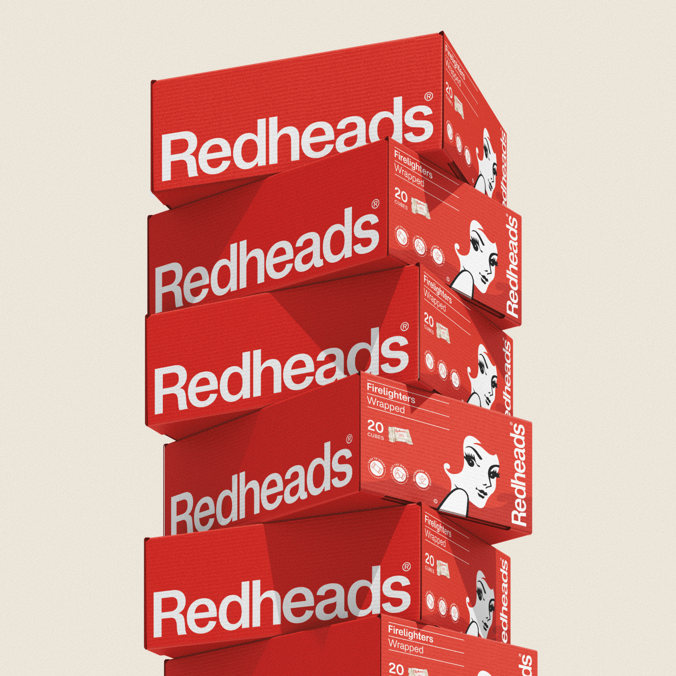
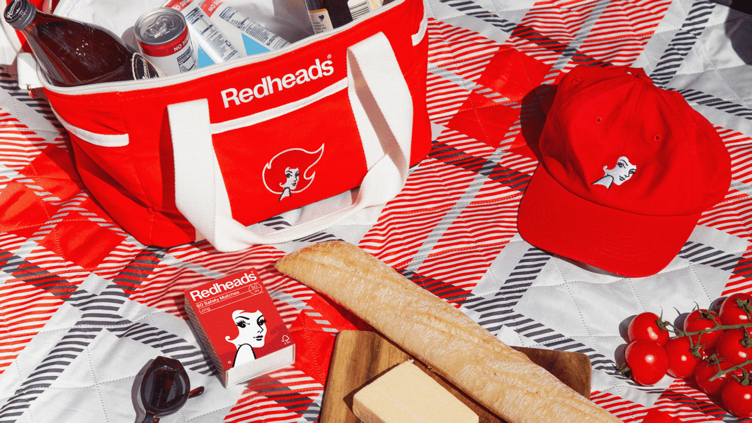
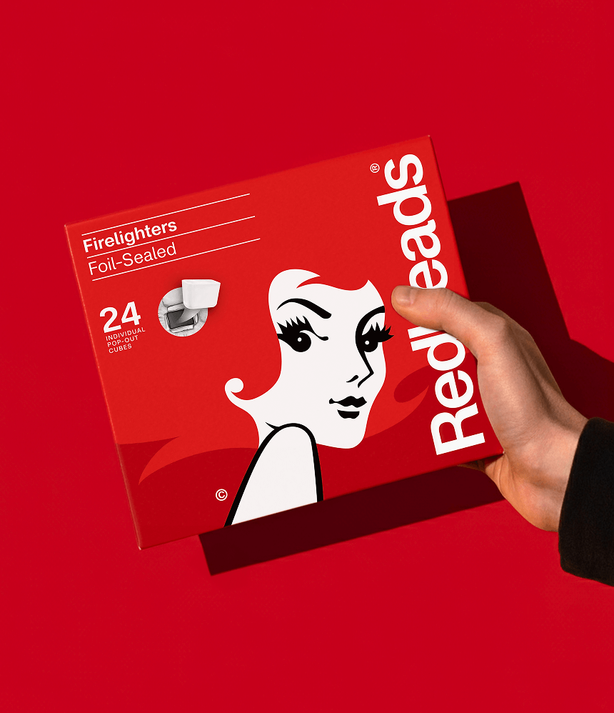
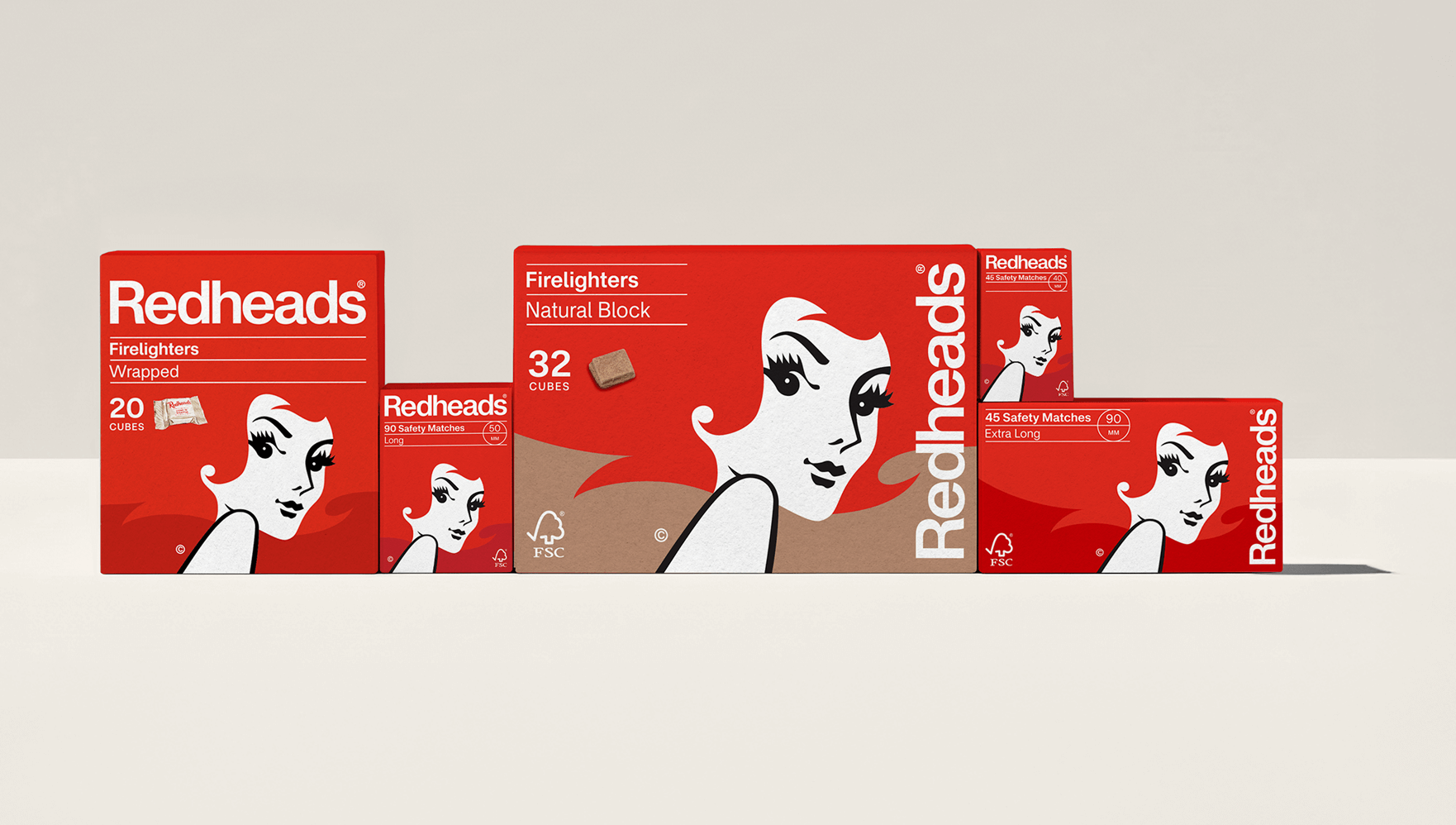
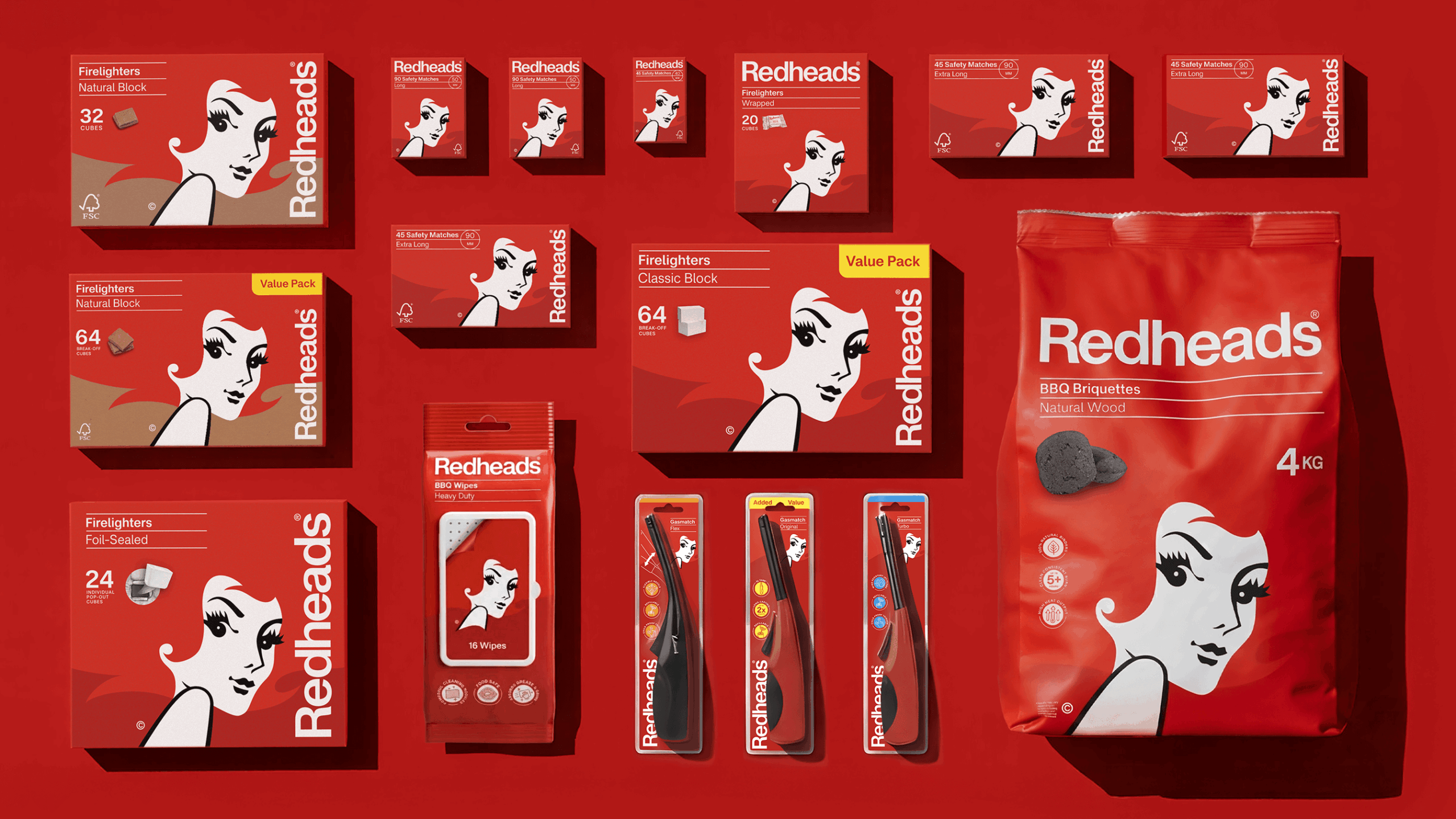
Cohesive packaging that flexes across formats
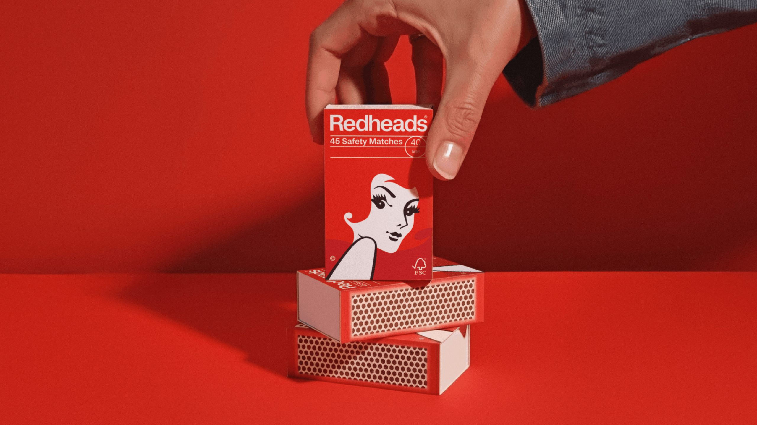
We revisited Redheads’ heritage wordmarks, blending them with a Swiss Modernist influence from the 1970s. The resulting refresh feels both timeless and in step with today’s typography and branding trends.
Our homage to the Swiss Modernist approach of the 1970s extended beyond the logo, influencing the way we structured the brand visually. We applied a flexible Swiss grid system, ensuring that all brand elements could be used consistently across packaging of different sizes and ratios.
This approach allowed us to maintain a cohesive, structured look while accommodating the variety of pack formats in the Redheads range. The system provides clarity and balance, making the packaging instantly recognisable and adaptable.
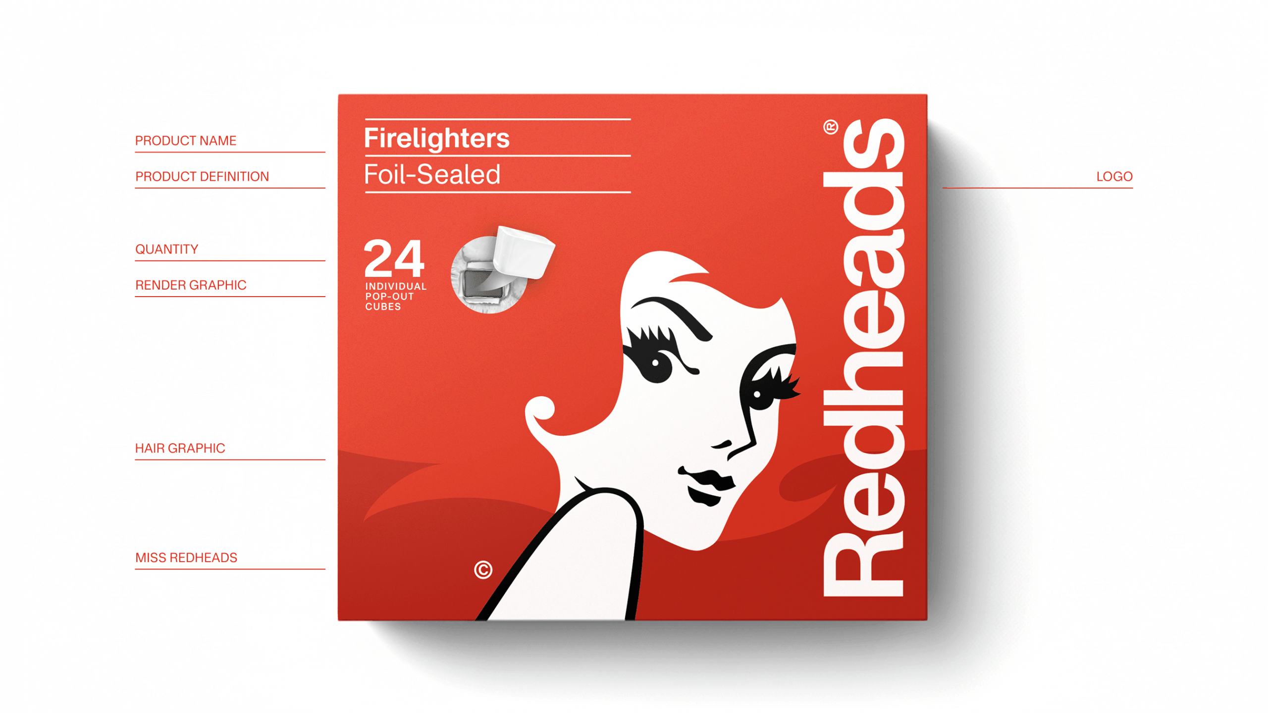
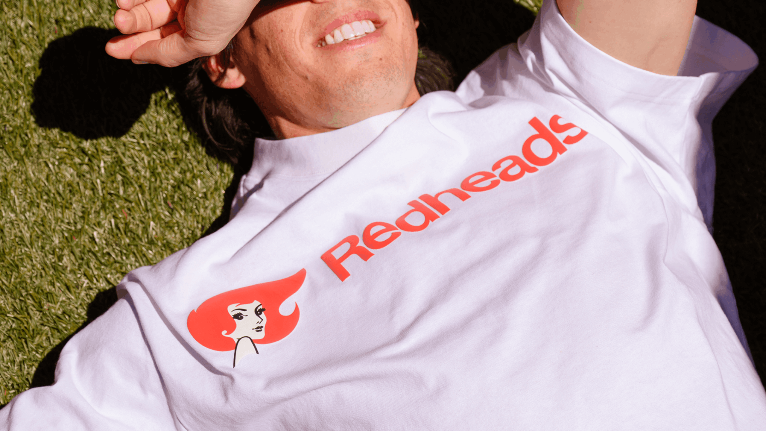
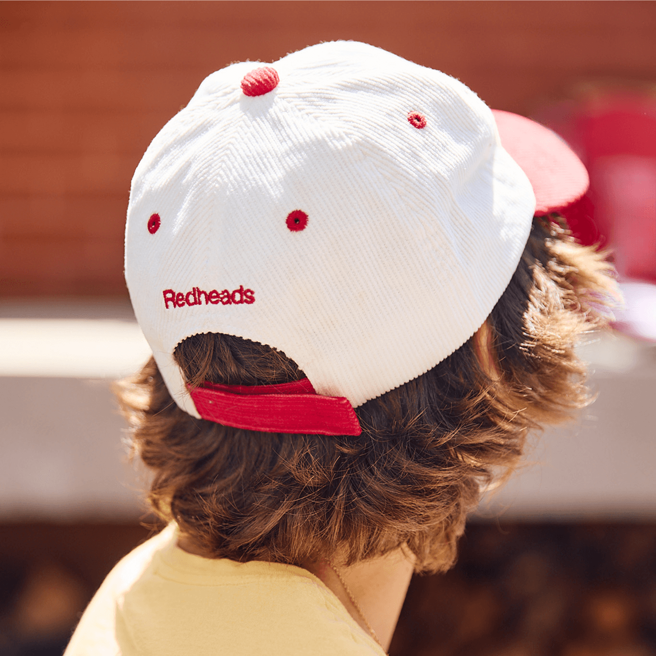
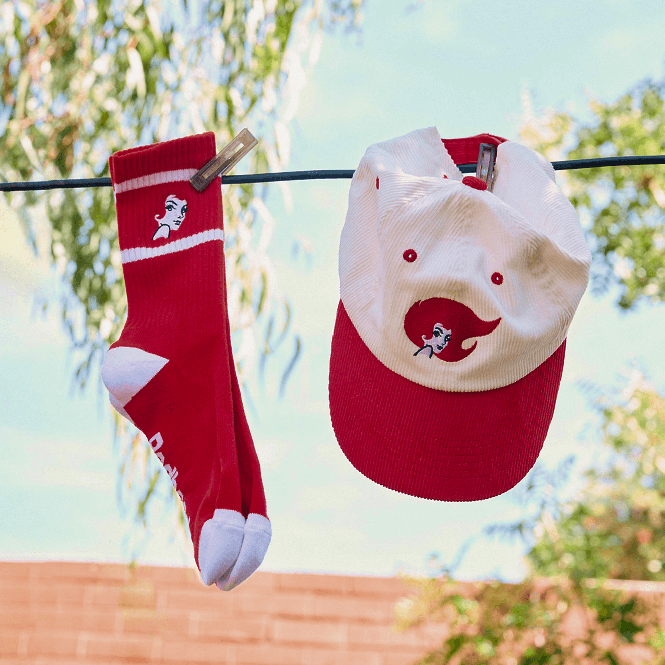
A fiery icon, refreshed for today
Ms Redheads is one of Australia’s most recognisable brand icons. To honour that legacy, we set out to evolve the mark without replacing it.
We drew on her repertoire of past looks, where her voluminous hair has long expressed personality. In the end, we simplified the treatment to keep it bold and iconic.
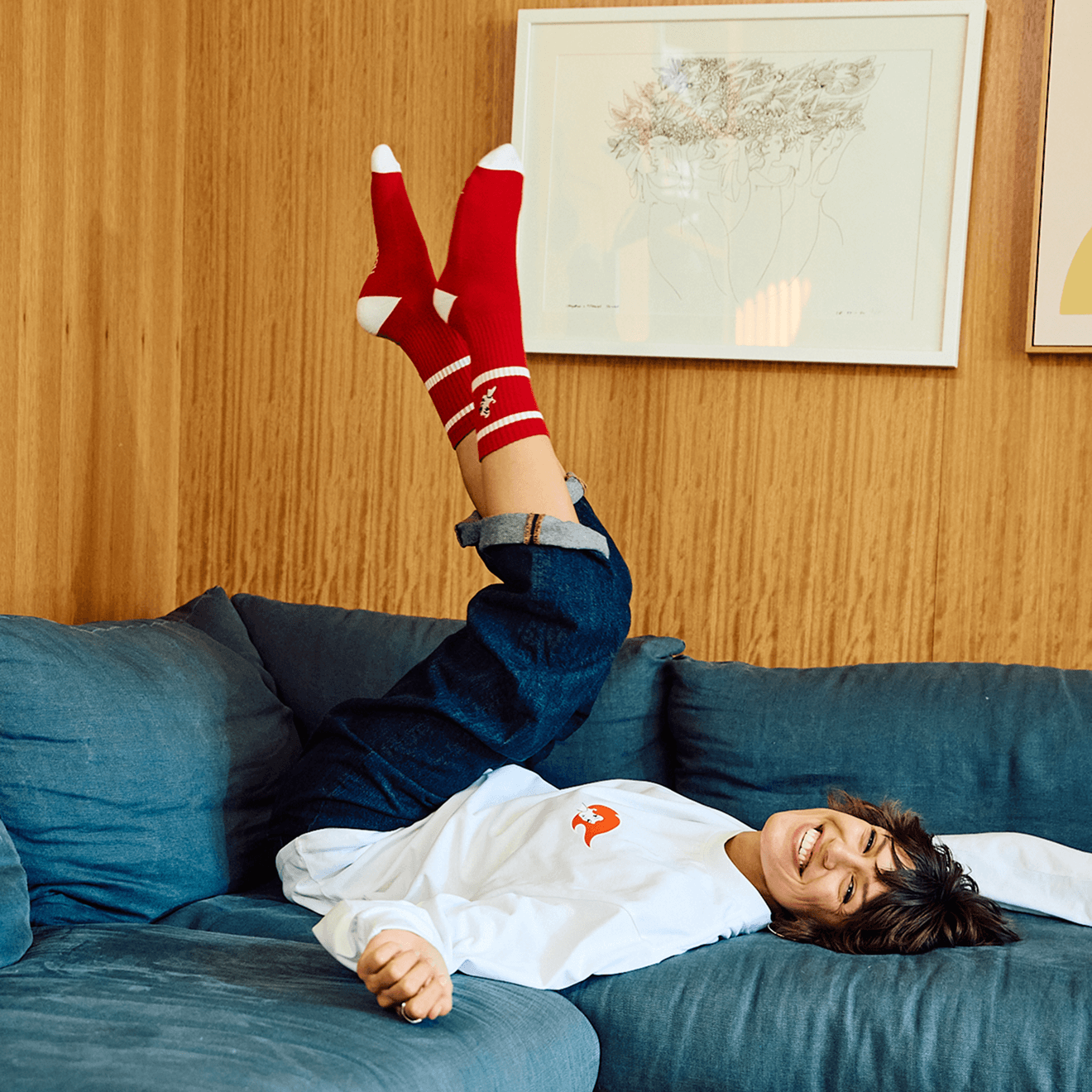
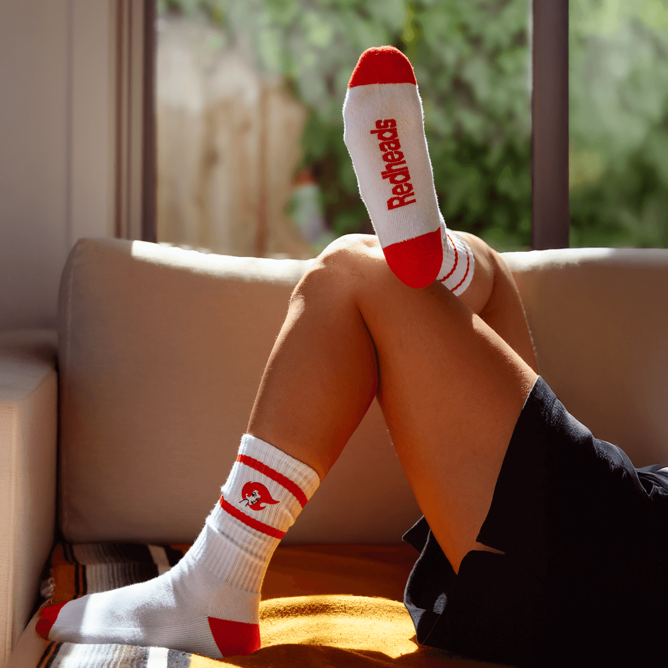
A nostalgic brand, evolved for e-commerce
The refreshed Redheads brand and packaging naturally extended into a reimagined digital experience. The new website was designed primarily as an e-commerce platform, promoting and selling both Redheads’ core products and their new range of nostalgia-inspired home items.
Beyond functionality, we saw an opportunity to bring the updated branding to life online, introducing experience-focused interface elements that make the website feel dynamic, engaging, and true to the brand’s personality.

“Updating a heritage brand like Redheads is no small task, but Oliver Grace approached it with care, craft and a deep respect for the brand’s legacy. Their fresh brand thinking across packaging and digital has given the brand new energy while staying true to what people love about it. It was a great partnership and we’re already seeing the results.”
Sparking new life into a beloved Aussie brand
Rebrands are a delicate balance. It’s an honour to be entrusted with such an iconic Aussie brand, and we approached its evolution with care. We’re proud to retain the fiery spirit and iconic imagery that makes Redheads so recognisable, while updating the look for a modern audience.
The result is a brand that captivates across formats and translates seamlessly to an e-commerce platform, allowing more people to discover and enjoy the full Redheads range.